> ## Documentation Index
> Fetch the complete documentation index at: https://cometchat-22654f5b-docs-agent-in-group-react-v6.mintlify.site/llms.txt
> Use this file to discover all available pages before exploring further.
# Message Header
> Display user or group details in the chat toolbar with CometChatMessageHeader component in React Native UI Kit, including typing indicators and navigation.
```json theme={null}
{
"component": "CometChatMessageHeader",
"package": "@cometchat/chat-uikit-react-native",
"import": "import { CometChatMessageHeader } from \"@cometchat/chat-uikit-react-native\";",
"description": "Displays user or group details in the chat toolbar with typing indicators and navigation controls.",
"props": {
"data": {
"user": {
"type": "CometChat.User",
"note": "User object for one-on-one chat header"
},
"group": {
"type": "CometChat.Group",
"note": "Group object for group chat header"
}
},
"callbacks": {
"onBack": "() => void",
"onError": "(error: CometChat.CometChatException) => void",
"onNewChatButtonClick": "() => void",
"onChatHistoryButtonClick": "() => void"
},
"visibility": {
"showBackButton": { "type": "boolean", "default": true },
"hideVoiceCallButton": { "type": "boolean", "default": false },
"hideVideoCallButton": { "type": "boolean", "default": false },
"usersStatusVisibility": { "type": "boolean", "default": true },
"hideNewChatButton": { "type": "boolean", "default": true },
"hideChatHistoryButton": { "type": "boolean", "default": true }
},
"viewSlots": {
"ItemView": "({ user, group }) => JSX.Element",
"LeadingView": "({ user, group }) => JSX.Element",
"TitleView": "({ user, group }) => JSX.Element",
"SubtitleView": "({ user, group }) => JSX.Element",
"TrailingView": "({ user, group }) => JSX.Element",
"AuxiliaryButtonView": "({ user, group }) => JSX.Element"
},
"options": {
"options": "({ user, group }) => MenuItemInterface[]"
}
},
"compositionExample": {
"description": "Header component for message view",
"components": [
"CometChatMessageHeader",
"CometChatMessageList",
"CometChatMessageComposer"
],
"flow": "Displays user/group info at top of chat, handles back navigation and call buttons"
}
}
```
## Where It Fits
`CometChatMessageHeader` is a [Component](/ui-kit/react-native/components-overview#components) that showcases the [User](/sdk/react-native/user-management) or [Group](/sdk/react-native/retrieve-groups) details in the toolbar. It presents a typing indicator and a back navigation button for ease of use.
 ***
## Minimal Render
```tsx lines theme={null}
import { CometChatMessageHeader } from "@cometchat/chat-uikit-react-native";
function MessageHeaderDemo() {
return ;
}
```
***
## Actions and Events
### Callback Props
#### onError
Fires on internal errors (network failure, auth issue, SDK exception).
```tsx lines theme={null}
onError?: (error: CometChat.CometChatException) => void
```
```tsx lines theme={null}
import { CometChatMessageHeader } from "@cometchat/chat-uikit-react-native";
import { CometChat } from "@cometchat/chat-sdk-react-native";
function MessageHeaderWithError() {
return (
{
console.error("MessageHeader error:", error);
}}
/>
);
}
```
#### onBack
Fires when the back button in the app bar is pressed. Requires `showBackButton={true}`.
```tsx lines theme={null}
onBack?: () => void
```
```tsx lines theme={null}
import { CometChatMessageHeader } from "@cometchat/chat-uikit-react-native";
function MessageHeaderWithBack() {
return (
{
console.log("Back pressed");
}}
/>
);
}
```
#### onNewChatButtonClick
Fires when the new chat button is pressed (only applies to AI Assistant users). Allows handling starting a new conversation with the AI assistant.
```tsx lines theme={null}
import { CometChatMessageHeader } from "@cometchat/chat-uikit-react-native";
function MessageHeaderWithNewChat() {
return (
{
console.log("Starting new AI chat");
}}
/>
);
}
```
#### onChatHistoryButtonClick
Fires when the chat history button is pressed (only applies to AI Assistant users). Allows handling opening the AI assistant chat history.
```tsx lines theme={null}
import { CometChatMessageHeader } from "@cometchat/chat-uikit-react-native";
function MessageHeaderWithHistory() {
return (
{
console.log("Opening AI chat history");
}}
/>
);
}
```
***
## Custom View Slots
Each slot replaces a section of the default UI. Slots that accept parameters receive the user or group object for customization.
| Slot | Signature | Replaces |
| --------------------- | ---------------------------------- | ---------------------------------- |
| `ItemView` | `({ user, group }) => JSX.Element` | Entire header layout |
| `LeadingView` | `({ user, group }) => JSX.Element` | Avatar / left section |
| `TitleView` | `({ user, group }) => JSX.Element` | Name / title text |
| `SubtitleView` | `({ user, group }) => JSX.Element` | Status / subtitle text |
| `TrailingView` | `({ user, group }) => JSX.Element` | Right section next to call buttons |
| `AuxiliaryButtonView` | `({ user, group }) => JSX.Element` | Replaces default call buttons |
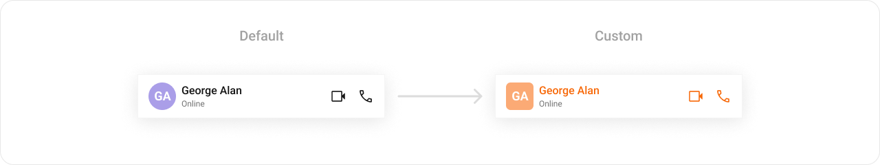
### TitleView
Custom view for the name / title text.
```tsx lines theme={null}
TitleView?: ({ user, group }) => JSX.Element
```
```tsx lines theme={null}
import { CometChatMessageHeader } from "@cometchat/chat-uikit-react-native";
import { CometChat } from "@cometchat/chat-sdk-react-native";
import { Text } from "react-native";
function TitleViewDemo() {
const getTitleView = ({
user,
group,
}: {
user?: CometChat.User;
group?: CometChat.Group;
}) => {
const name = user ? user.getName() : group?.getName();
return (
{name}
);
};
return ;
}
```
### AuxiliaryButtonView
Custom buttons that replace the default call buttons.
```tsx lines theme={null}
AuxiliaryButtonView?: ({ user, group }) => JSX.Element
```
```tsx lines theme={null}
import { CometChatMessageHeader } from "@cometchat/chat-uikit-react-native";
import { CometChat } from "@cometchat/chat-sdk-react-native";
import { TouchableOpacity, Text } from "react-native";
function AuxiliaryButtonDemo() {
const getAuxiliaryView = ({
user,
group,
}: {
user?: CometChat.User;
group?: CometChat.Group;
}) => {
return (
console.log("Custom action")}>
Custom Button
);
};
return (
);
}
```
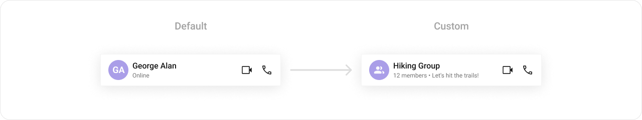
### ItemView
Custom view for the entire header layout.
```tsx lines theme={null}
ItemView?: ({ user, group }) => JSX.Element
```
```tsx lines theme={null}
import { CometChatMessageHeader } from "@cometchat/chat-uikit-react-native";
import { CometChat } from "@cometchat/chat-sdk-react-native";
import { View, Text } from "react-native";
function ItemViewDemo() {
const getItemView = ({
user,
group,
}: {
user?: CometChat.User;
group?: CometChat.Group;
}) => {
const name = user ? user.getName() : group?.getName();
return (
{name}
);
};
return ;
}
```
### SubtitleView
Custom view for the subtitle / status text.
```tsx lines theme={null}
SubtitleView?: ({ user, group }) => JSX.Element
```
***
## Minimal Render
```tsx lines theme={null}
import { CometChatMessageHeader } from "@cometchat/chat-uikit-react-native";
function MessageHeaderDemo() {
return ;
}
```
***
## Actions and Events
### Callback Props
#### onError
Fires on internal errors (network failure, auth issue, SDK exception).
```tsx lines theme={null}
onError?: (error: CometChat.CometChatException) => void
```
```tsx lines theme={null}
import { CometChatMessageHeader } from "@cometchat/chat-uikit-react-native";
import { CometChat } from "@cometchat/chat-sdk-react-native";
function MessageHeaderWithError() {
return (
{
console.error("MessageHeader error:", error);
}}
/>
);
}
```
#### onBack
Fires when the back button in the app bar is pressed. Requires `showBackButton={true}`.
```tsx lines theme={null}
onBack?: () => void
```
```tsx lines theme={null}
import { CometChatMessageHeader } from "@cometchat/chat-uikit-react-native";
function MessageHeaderWithBack() {
return (
{
console.log("Back pressed");
}}
/>
);
}
```
#### onNewChatButtonClick
Fires when the new chat button is pressed (only applies to AI Assistant users). Allows handling starting a new conversation with the AI assistant.
```tsx lines theme={null}
import { CometChatMessageHeader } from "@cometchat/chat-uikit-react-native";
function MessageHeaderWithNewChat() {
return (
{
console.log("Starting new AI chat");
}}
/>
);
}
```
#### onChatHistoryButtonClick
Fires when the chat history button is pressed (only applies to AI Assistant users). Allows handling opening the AI assistant chat history.
```tsx lines theme={null}
import { CometChatMessageHeader } from "@cometchat/chat-uikit-react-native";
function MessageHeaderWithHistory() {
return (
{
console.log("Opening AI chat history");
}}
/>
);
}
```
***
## Custom View Slots
Each slot replaces a section of the default UI. Slots that accept parameters receive the user or group object for customization.
| Slot | Signature | Replaces |
| --------------------- | ---------------------------------- | ---------------------------------- |
| `ItemView` | `({ user, group }) => JSX.Element` | Entire header layout |
| `LeadingView` | `({ user, group }) => JSX.Element` | Avatar / left section |
| `TitleView` | `({ user, group }) => JSX.Element` | Name / title text |
| `SubtitleView` | `({ user, group }) => JSX.Element` | Status / subtitle text |
| `TrailingView` | `({ user, group }) => JSX.Element` | Right section next to call buttons |
| `AuxiliaryButtonView` | `({ user, group }) => JSX.Element` | Replaces default call buttons |
### TitleView
Custom view for the name / title text.
```tsx lines theme={null}
TitleView?: ({ user, group }) => JSX.Element
```
```tsx lines theme={null}
import { CometChatMessageHeader } from "@cometchat/chat-uikit-react-native";
import { CometChat } from "@cometchat/chat-sdk-react-native";
import { Text } from "react-native";
function TitleViewDemo() {
const getTitleView = ({
user,
group,
}: {
user?: CometChat.User;
group?: CometChat.Group;
}) => {
const name = user ? user.getName() : group?.getName();
return (
{name}
);
};
return ;
}
```
### AuxiliaryButtonView
Custom buttons that replace the default call buttons.
```tsx lines theme={null}
AuxiliaryButtonView?: ({ user, group }) => JSX.Element
```
```tsx lines theme={null}
import { CometChatMessageHeader } from "@cometchat/chat-uikit-react-native";
import { CometChat } from "@cometchat/chat-sdk-react-native";
import { TouchableOpacity, Text } from "react-native";
function AuxiliaryButtonDemo() {
const getAuxiliaryView = ({
user,
group,
}: {
user?: CometChat.User;
group?: CometChat.Group;
}) => {
return (
console.log("Custom action")}>
Custom Button
);
};
return (
);
}
```
### ItemView
Custom view for the entire header layout.
```tsx lines theme={null}
ItemView?: ({ user, group }) => JSX.Element
```
```tsx lines theme={null}
import { CometChatMessageHeader } from "@cometchat/chat-uikit-react-native";
import { CometChat } from "@cometchat/chat-sdk-react-native";
import { View, Text } from "react-native";
function ItemViewDemo() {
const getItemView = ({
user,
group,
}: {
user?: CometChat.User;
group?: CometChat.Group;
}) => {
const name = user ? user.getName() : group?.getName();
return (
{name}
);
};
return ;
}
```
### SubtitleView
Custom view for the subtitle / status text.
```tsx lines theme={null}
SubtitleView?: ({ user, group }) => JSX.Element
```
 ```tsx lines theme={null}
import { CometChatMessageHeader } from "@cometchat/chat-uikit-react-native";
import { CometChat } from "@cometchat/chat-sdk-react-native";
import { Text } from "react-native";
function SubtitleViewDemo() {
const getSubtitleView = ({
user,
group,
}: {
user?: CometChat.User;
group?: CometChat.Group;
}) => {
if (user) {
return Online;
}
return {group?.getMembersCount()} members;
};
return ;
}
```
### LeadingView
Custom view for the avatar / left section.
```tsx lines theme={null}
LeadingView?: ({ user, group }) => JSX.Element
```
```tsx lines theme={null}
import { CometChatMessageHeader } from "@cometchat/chat-uikit-react-native";
import { CometChat } from "@cometchat/chat-sdk-react-native";
import { View, Text } from "react-native";
function LeadingViewDemo() {
const getLeadingView = ({
user,
group,
}: {
user?: CometChat.User;
group?: CometChat.Group;
}) => {
const name = user ? user.getName() : group?.getName();
return (
{name?.charAt(0)}
);
};
return ;
}
```
### TrailingView
Custom view for the right section next to call buttons.
```tsx lines theme={null}
TrailingView?: ({ user, group }) => JSX.Element
```
```tsx lines theme={null}
import { CometChatMessageHeader } from "@cometchat/chat-uikit-react-native";
import { CometChat } from "@cometchat/chat-sdk-react-native";
import { Text } from "react-native";
function SubtitleViewDemo() {
const getSubtitleView = ({
user,
group,
}: {
user?: CometChat.User;
group?: CometChat.Group;
}) => {
if (user) {
return Online;
}
return {group?.getMembersCount()} members;
};
return ;
}
```
### LeadingView
Custom view for the avatar / left section.
```tsx lines theme={null}
LeadingView?: ({ user, group }) => JSX.Element
```
```tsx lines theme={null}
import { CometChatMessageHeader } from "@cometchat/chat-uikit-react-native";
import { CometChat } from "@cometchat/chat-sdk-react-native";
import { View, Text } from "react-native";
function LeadingViewDemo() {
const getLeadingView = ({
user,
group,
}: {
user?: CometChat.User;
group?: CometChat.Group;
}) => {
const name = user ? user.getName() : group?.getName();
return (
{name?.charAt(0)}
);
};
return ;
}
```
### TrailingView
Custom view for the right section next to call buttons.
```tsx lines theme={null}
TrailingView?: ({ user, group }) => JSX.Element
```
 ```tsx lines theme={null}
import { CometChatMessageHeader } from "@cometchat/chat-uikit-react-native";
import { CometChat } from "@cometchat/chat-sdk-react-native";
import { TouchableOpacity, Text } from "react-native";
function TrailingViewDemo() {
const getTrailingView = ({
user,
group,
}: {
user?: CometChat.User;
group?: CometChat.Group;
}) => {
return (
console.log("Menu pressed")}>
⋮
);
};
return ;
}
```
***
## Styling
Using Style you can customize the look and feel of the component in your app. Pass a styling object as a prop to the `CometChatMessageHeader` component.
```tsx lines theme={null}
import { CometChatMessageHeader } from "@cometchat/chat-uikit-react-native";
import { CometChat } from "@cometchat/chat-sdk-react-native";
import { TouchableOpacity, Text } from "react-native";
function TrailingViewDemo() {
const getTrailingView = ({
user,
group,
}: {
user?: CometChat.User;
group?: CometChat.Group;
}) => {
return (
console.log("Menu pressed")}>
⋮
);
};
return ;
}
```
***
## Styling
Using Style you can customize the look and feel of the component in your app. Pass a styling object as a prop to the `CometChatMessageHeader` component.
 ```tsx lines theme={null}
import { CometChatMessageHeader } from "@cometchat/chat-uikit-react-native";
function StylingDemo() {
return (
);
}
```
### Visibility Props
| Property | Description | Code |
| ----------------------- | ---------------------------------------------------------- | --------------------------------- |
| `showBackButton` | Toggle visibility of the back button in the app bar | `showBackButton?: boolean` |
| `hideVoiceCallButton` | Toggle visibility of the voice call button | `hideVoiceCallButton?: boolean` |
| `hideVideoCallButton` | Toggle visibility of the video call button | `hideVideoCallButton?: boolean` |
| `usersStatusVisibility` | Toggle user status visibility | `usersStatusVisibility?: boolean` |
| `hideNewChatButton` | Toggle visibility of new chat button for AI Assistants | `hideNewChatButton?: boolean` |
| `hideChatHistoryButton` | Toggle visibility of chat history button for AI Assistants | `hideChatHistoryButton?: boolean` |
### options
Custom menu items for the header options menu.
```tsx lines theme={null}
options?: ({ user, group }) => MenuItemInterface[]
```
```tsx lines theme={null}
import { CometChatMessageHeader } from "@cometchat/chat-uikit-react-native";
import { CometChat } from "@cometchat/chat-sdk-react-native";
function OptionsDemo() {
const getOptions = ({
user,
group,
}: {
user?: CometChat.User;
group?: CometChat.Group;
}) => {
return [
{
text: "View Profile",
onPress: () => { /* view profile logic */ },
},
{
text: "Block User",
onPress: () => { /* block logic */ },
},
];
};
return ;
}
```
***
## Next Steps
Display the list of messages in a conversation
Compose and send messages in a chat
Complete messaging interface with header, list, and composer
Customize the appearance of UI Kit components
```tsx lines theme={null}
import { CometChatMessageHeader } from "@cometchat/chat-uikit-react-native";
function StylingDemo() {
return (
);
}
```
### Visibility Props
| Property | Description | Code |
| ----------------------- | ---------------------------------------------------------- | --------------------------------- |
| `showBackButton` | Toggle visibility of the back button in the app bar | `showBackButton?: boolean` |
| `hideVoiceCallButton` | Toggle visibility of the voice call button | `hideVoiceCallButton?: boolean` |
| `hideVideoCallButton` | Toggle visibility of the video call button | `hideVideoCallButton?: boolean` |
| `usersStatusVisibility` | Toggle user status visibility | `usersStatusVisibility?: boolean` |
| `hideNewChatButton` | Toggle visibility of new chat button for AI Assistants | `hideNewChatButton?: boolean` |
| `hideChatHistoryButton` | Toggle visibility of chat history button for AI Assistants | `hideChatHistoryButton?: boolean` |
### options
Custom menu items for the header options menu.
```tsx lines theme={null}
options?: ({ user, group }) => MenuItemInterface[]
```
```tsx lines theme={null}
import { CometChatMessageHeader } from "@cometchat/chat-uikit-react-native";
import { CometChat } from "@cometchat/chat-sdk-react-native";
function OptionsDemo() {
const getOptions = ({
user,
group,
}: {
user?: CometChat.User;
group?: CometChat.Group;
}) => {
return [
{
text: "View Profile",
onPress: () => { /* view profile logic */ },
},
{
text: "Block User",
onPress: () => { /* block logic */ },
},
];
};
return ;
}
```
***
## Next Steps
Display the list of messages in a conversation
Compose and send messages in a chat
Complete messaging interface with header, list, and composer
Customize the appearance of UI Kit components