> ## Documentation Index
> Fetch the complete documentation index at: https://cometchat-22654f5b-docs-agent-in-group-react-v6.mintlify.site/llms.txt
> Use this file to discover all available pages before exploring further.
# Introduction
> Customize CometChat iOS UI Kit themes with global colors, typography, spacing, component styles, branding, and light or dark mode.
| Field | Value |
| --------------------- | ---------------------------------------------------------------------------- |
| Platform | iOS UI Kit |
| Package | `CometChatUIKitSwift` |
| Theme Class | `CometChatTheme` — Global theming system for all CometChat components |
| Primary Color | `CometChatTheme.primaryColor = UIColor` |
| Background Colors | `CometChatTheme.backgroundColor01`, `backgroundColor02`, `backgroundColor03` |
| Border Colors | `CometChatTheme.borderColorDefault`, `borderColorLight`, `borderColorDark` |
| Typography Class | `CometChatTypography` |
| Typography Properties | `Body.regular`, `Body.bold`, `Heading.regular` |
| Apply Timing | Set theme before `CometChatUIKit.init()` |
| Example | `CometChatTheme.primaryColor = UIColor(hex: "#F76808")` |
## Overview
Theming in CometChat for iOS allows you to create visually consistent and customizable user interfaces that align with your application's branding. The `CometChatTheme` system enables global theming, customization of colors, typography, spacing, and component-specific styles to enhance the user experience across all CometChat components.
With global styles and an easy-to-override architecture, you can seamlessly apply themes at both a global and component level.
***
## Using Theming in Your Project
### Global Theming
Set up the global theme for your application during app launch. This ensures all CometChat components use the specified theme.
```swift lines theme={null}
import UIKit
import CometChatSDK
@main
class AppDelegate: UIResponder, UIApplicationDelegate {
var window: UIWindow?
func application(
_ application: UIApplication,
didFinishLaunchingWithOptions launchOptions: [UIApplication.LaunchOptionsKey: Any]?
) -> Bool {
// Apply the global theme
CometChatTheme.primaryColor = UIColor.systemBackground
// Apply custom typography
CometChatTypography.Body.regular = UIFont.systemFont(ofSize: 18, weight: .bold)
return true
}
}
```
 ***
## Customization
### Customizing Colors
Override specific color attributes globally in `CometChatTheme`. This is equivalent to overriding attributes in Android's `themes.xml`.
```swift lines theme={null}
// Set a custom primary color
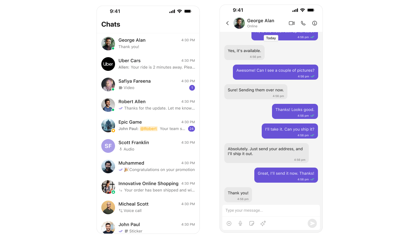
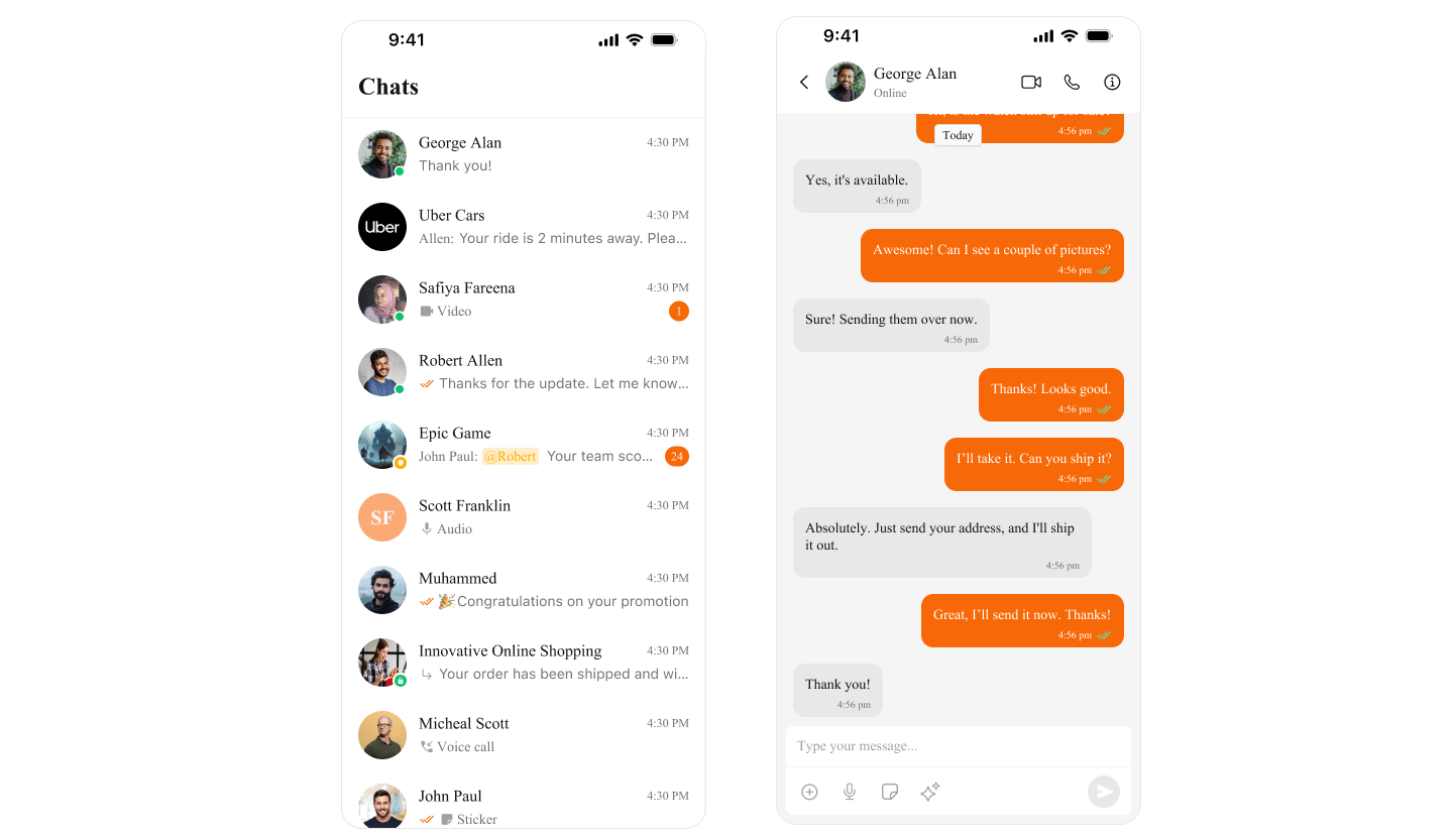
CometChatTheme.primaryColor = UIColor(hex: "#F76808")
```
***
## Customization
### Customizing Colors
Override specific color attributes globally in `CometChatTheme`. This is equivalent to overriding attributes in Android's `themes.xml`.
```swift lines theme={null}
// Set a custom primary color
CometChatTheme.primaryColor = UIColor(hex: "#F76808")
```
 ***
## Next Steps
Customize theme colors and dark mode
Style individual components
Customize message bubbles
***
## Next Steps
Customize theme colors and dark mode
Style individual components
Customize message bubbles